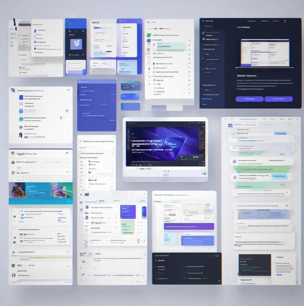
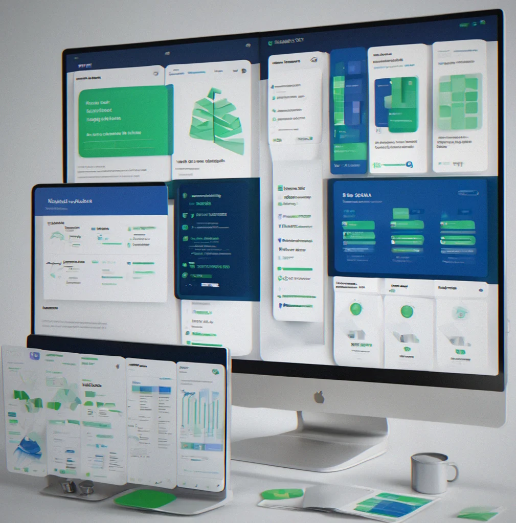
Figma libraries, component code, and design tokens that integrate with your tools instead of forcing you to switch them out.
Same project, different client. Same spacing arguments with your team. Same time wasted on decisions you've already made. There's a faster way.
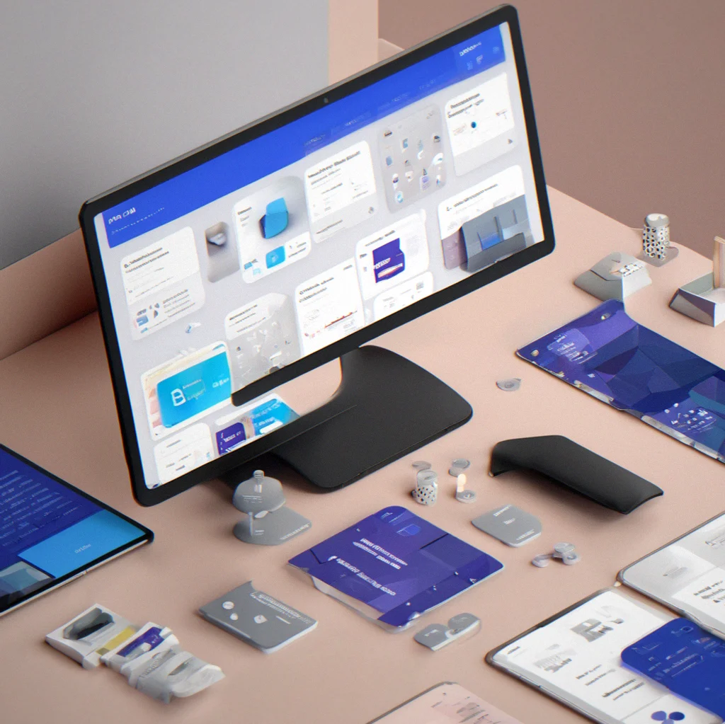
Bluesource is a set of design systems that slot into Figma and your code editor—not something that replaces them. Libraries that don't need constant governance. CSS frameworks with built-in states. Brand templates you adjust instead of rewrite. Most teams burn through their budget on naming alone. This doesn't.
Quit keeping systems in scattered docs and Slack threads. Start shipping them.
What you actually get
Six reasons you stop rebuilding the same system every project
1
tok
Design tokens that actually transfer
Export once to Figma, CSS, Tailwind, or iOS — naming's already done. Semantic, organized hierarchically, ready to hand off to the team. You stop maintaining scattered spreadsheets and Notion docs that sit between design and code.
2
fig
Figma components that scale
You get close to 50 preset states built across buttons, forms, and layouts. Main component plus variants, all nested and organized and actually documented. Drag one into a mockup and it works. No governance headaches either.
3
css
CSS framework with states already baked in
Not just another utility thing. This includes form states, error handling, loading states, focus states — all pre-built. Drop it into VS Code, wire it into your build, or just use it as a reference while you build your own version.
4
gui
Brand guidelines that actually get used
It's a real template, not a template. Color rules, typography specs, logo usage guidelines — all editable, all wired into your design tokens. Tweak what you need, export as PDF or HTML, hand it to the client. That's it.
5
wor
Fits into your workflow
Lives inside Figma, inside VS Code, inside whatever handoff tool you use. It doesn't ask you to change how you work. Just removes the tedious parts. You're looking at cutting something like 8 to 12 hours per project when you factor in naming decisions, system setup, and getting design and dev on the same page.
6
con
Consistency without endless syncs
Define a component once and it's locked in everywhere. Figma and code stay in sync automatically. Token updates roll out across the board. What usualyl kills projects — the gap between what design hands off and what actually gets built — just disappears.
8 reasons your next project moves faster
Build once. Use everywhere. Stop arguing about names.
co
47 pre-built component states
Buttons, forms, tables, modals. All of them come with hover, focus, disabled, and error states already wired up. Your designer won't have to redraw the same button a dozen different ways.
to
Tokens that sync automatically
Change a color in one place and it updates everywhere at once. Figma, CSS, your handoff platform. No manual exports, no guessing whether design and code are actually in sync.
cs
CSS framework ready to ship
You get form states, loading indicators, focus rings, and dark mode built in. Just integrate it, use what's there, or tweak it to fit your needs.
na
Semantic naming you actually use
Names describe what things do, not what they look like. `--color-interactive-primary` instead of `--blue-500`. Developers get it right away.
gu
Brand guidelines that export
Color specs, typography rules, logo usage, spacing ratios. Everything's editable and connected to your tokens. Export to PDF for clients or as HTML for your own team.
in
No tool replacement required
Works inside Figma, VS Code, your handoff platform. Your workflow stays the same. It just removes the tedious parts that eat time and create inconsistency.
ti
Cuts naming decision time by 8–12 hours
The naming hierarchy is done. Spacing scale is locked. Colors already relate to each other. New project starts and you're designing instead of stuck in the first week of debates.
re
Prevents costly rework
Component changes ripple through automatically. When design and code actually match, you skip the misalignment that usually means a week of back-and-forth near the end. Consistency kills that problem.
SYNC
The problem
You've solved this before. Every project.
A new client comes in and you start building their design system from scratch. Naming conventions. Token structure. Component architecture. Spacing scale. Color relationships. Documentation. Then you hand it off and the whole thing immediately falls out of sync because design lives in Figma and code lives in VS Code and there's no single source of truth. Six months later someone's still using the old button component. A designer updates the color palette but the CSS never gets touched. You're burning time managing inconsistency instead of actually designing or building anything. This happens on almost every engagement because you don't have a baseline you can lean on. You can't reuse what you built last time because every client's different, right? Except they're not really. The structure's the same. The problems are the same. You're having the same naming debates. Only the colors and typography shift.
Stop rebuilding. Start customizing.
How design systems actually work
Nine ways Bluesource cuts through the repetitive stuff
Tokens sync across 5 platforms
Change a color value once in the token file and it updates in Figma, CSS, Tailwind config, and your design handoff tool automatically. No manual exports. No version mismatches between design and code.
Component instances stay connected
You edit the main component and every instance updates. No stale variants floating around in old files. Your design file becomes the actual source of truth instead of something designers just drift away from.
Form states are pre-built
Default, hover, focus, disabled, error, loading. All there. You don't have to invent them from scratch for every new project. Just this alone saves a few hours per form-heavy design.
CSS framework with semantic naming
Classes are named by what they do, not what they look like. `btn-interactive-primary` instead of `blue-button`. Developers get it immediately without cracking open the docs.
Brand guidelines export as HTML or PDF
Template comes with color specs, typography rules, spacing scales, logo usage — all editable. Ship it as PDF for clients or HTML for your internal site. Takes minutes instead of building something custom.
Naming decisions are already made
Semantic hierarchy for tokens is locked in. Spacing scale is set. Color relationships are defined. You skip the first week of debating whether spacing should be 8px or 12px. The architecture is settled.
Handoff integration happens automatically
Figma exports plug into your handoff platform without manual setup. Component names, measurements, token references all flow through. Developers see structured specs instead of just screenshots.
Consistency prevents rework
When design and code are in sync, miswlignment shows up right away instead of three weeks into development. Changes propagate everywhere at once. You dodge the expensive late-stage rework cycle.
Reusable across nine different projects
One system architecture. You customize the colors, typography, spacing but not the structure itself. Every new client starts with a foundation instead of starting over. That's 8 to 12 hours saved per engagement on setup alone.
1 / 9
What you actually get
Design tokens you can ship out
Semantic naming that makes sense. Colors tied together, spacing grids, type families—everything in one place. Send it out as CSS, Tailwind, JSON, or iOS code. No manual work required.
Figma library. 47 component states ready to go
Buttons, forms, tables, modals all mapped out with default, hover, focus, disabled, error, and loading states. You're not building variations from scratch or wondering what you missed.
CSS that's actually structured
Real preset classes with semantic names and full state coverage. Drop it in your build and it works. Or use it as a referenfe while you build your own version. Either way you're not starting from nothing.
Brand guidelines that actually work
Color specs, type rules, spacing ratios, logo usage all in one template. Make it yours and export to PDF for clients or HTML for the team. Takes minutes instead of a full day.
Handoff platform integration
Figma exports connect without manual setup. Component specs, measurements, token references all flow through automatically. Developers get actual data instead of screenshots and guesses.
Sync happens on its own
Change a token and everything updates at once. Figma, code, handoff specs, all of it. No version mismatches. No finding out weeks later that design picked one color and engineering used another. One source of truth saves the rework that usually eats a week.
47 component states. One source of truth.
What you actually get when you're not rebuilding everything from scratch
Save 8–12 hours per project
The naming's already settled. Spacing scale is locked down. Color relationships are figured out. Your team doesn't waste the first week arguing about architecture that should've been decided months prior. You jump straight into designing.
Design and code actually stay in sync
Change a component in Figma and code updates on its own. When updates hit everywhere simultaneously, that misalignment that normally shows up three weeks into dev just doesn't happen. You avoid the rework cycle entirely.
Works across different projects
One system that bends to whatever you need. Swap the color palette, tweak the typography, shift spacing around. The underlying structure doesn't change. Every new project starts with something solid instead of a blank slate.
Fits into tools you already have
Figma, VS Code, handoff platforms—you're not learning anything new. Slots right into what you're using daily and takes out the tedious stuff that slows you down.
Questions answered
Common concerns about using Bluesource
These systems are vetted and modular. They're built to slot into your existing workflow, not tear it apart. Most teams start saving time on their first project.
No. Bluesource sits inside Figma, VS Code, and your handoff platform. You're not learning new software. The tokens plug into tools you're already using every day. Everything's optional—tweak it or leave it as-is.
Yeah. The structure stays fixed (that's what makes it efficient), but colors, fonts, spacing, and logos are all yours to change. Export it as PDF, HTML, or leave it running live in Figma. Most teams finish customizing in a few hours.
Depends. If you've got a working system already, Bluesource probably isn't what you need. If your system lives scattered between Figma, Notion, and whoever remembers it, then yeah—this pulls it together. Starting from scratch? This gives you something solid to build on.
First project. You skip the naming arguments, the architecture discussions, and the initial token setup. By project two, customization takes minutes instead of days.
Take the 47 existing states as your guide and build custom ones using the same naming system. It's designed to expand, not restrict. Your custom components work exactly like the built-in ones.
Yes. Token updates push to Figma and CSS at the same time. Component changes show everywhere they're used. Drift comes from systems that aren't talking to each other—this removes that gap. You stop rebuilding things because design picked one color and code picked another.